MacAlister Elliott and Partners Ltd is a long established fisheries consultancy based in Lymington. I was familiar with the company because I cycle past their striking offices every day on my way into the Tinstar studio; so when they contacted ‘the bloke with the green sailing bag on his back’ to help with a rebrand, no one was more pleased than I.
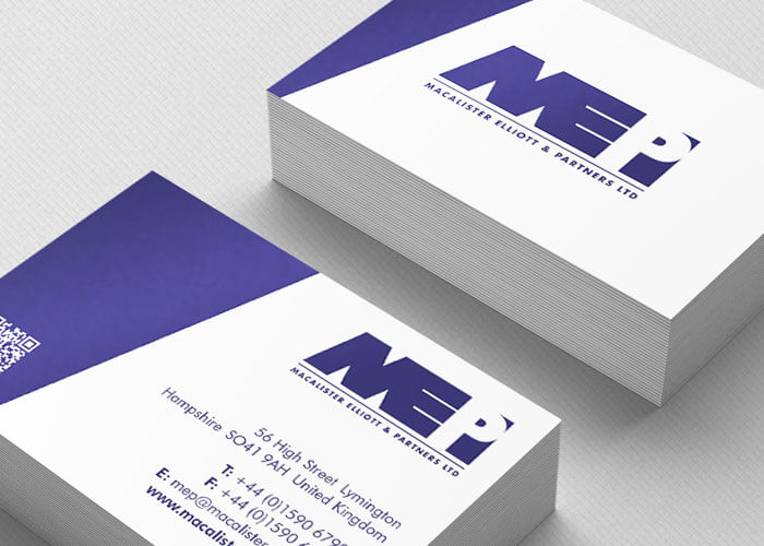
The project started with the re-design of the MEP logo and stationery suite. Without veering too far away from their already recognisable logo, we developed an identity that was simple, clean and practical. A new suite of stationery cemented the new brand.
Following the completion of the identity, we moved onto the design and development of the new responsive, content managed MEP website. The brief called for an easily searchable solution that showcased the global projects undertaken by the company. A Google map with custom markers was implemented that can be filtered by project type as well as location.
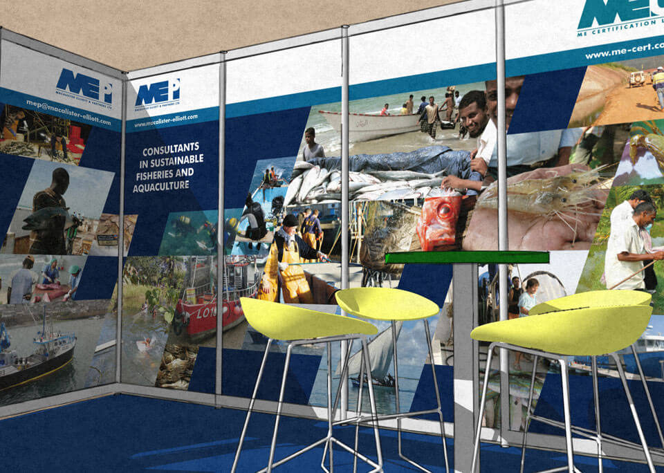
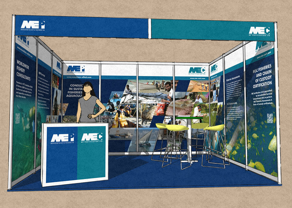
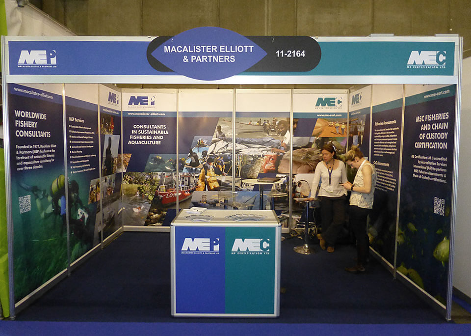
A large exhibition stand design for the Seafood Expo in Brussels was next on the list. When designing exhibition graphics for a stand such as this, we render a realistic 3D version of the stand using the actual graphics in order to give the most accurate representation of how the stand will appear. This helps to identify potential design issues in advance, whilst giving the client a much clearer preview of the final result prior to production.

