The Larger London Land Company
Logo Design, Print Management, Stationery Design

When first discussing the possibility of designing a new identity for The Larger London Land Company, we were surprised to discover that the company had been trading for over 100 years without the benefit of a logo.

We were honoured, therefore, to be the first design studio to create a logo for a business over one century old. The length of the name itself presented something of a challenge, but the client was pleased with the finished result, which took a modern approach to the iconography, balancing it with solid blocks of traditional colour.

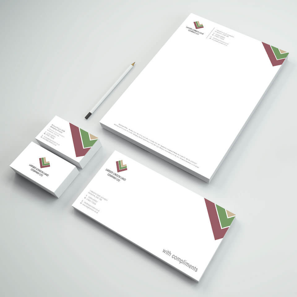
A full suite of stationery followed the design of the logo, which was designed and print-managed by Tinstar.
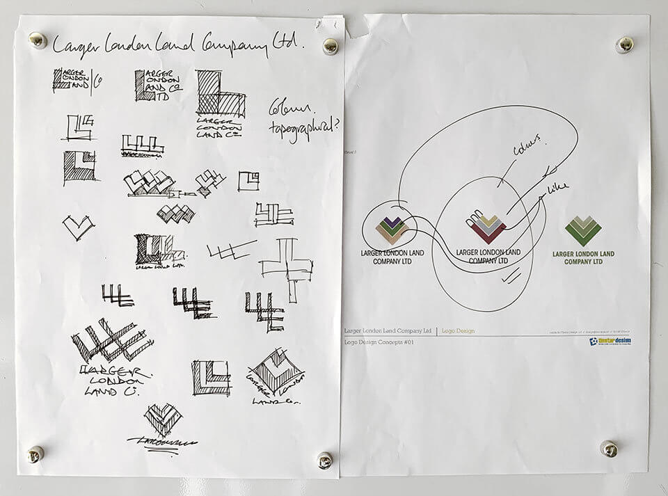
The Larger London Land Company Logo Concepts

The process of logo design involves the development of a number of concepts before a final design is arrived at. The preferred design concepts are gradually refined into the finished article.

The Larger London Land Company Logo Rough Concepts

Some of the rough concepts we put together for consideration.

The Larger London Land Company Logo Final Design

The Larger London Land Company Logo and Stationery Design

Professional Hardworking Team

We have used them on several designs for the Company now, they have good sound ideas and the turn around time is efficient and their costs are reasonable.

Susan Woods

Trustpilot Review

Get a Quote