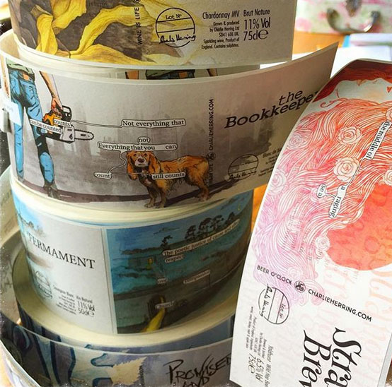
I can’t believe it’s taken this long to write a post about the series of Charlie Herring Wines labels that we designed last summer. As creatively indulgent projects go, this was an absolute doozy.
Inspired by the remarkable ‘A Humument’ by Tom Phillips, this series of highly illustrated and contemporary labels was a pleasure to work on. A Humument (A Human Document) was a Victorian novel bought for threepence in a junk shop in 1966 by the artist. He spent the next 50 years altering every page, by using painting, collage or cut-up techniques. Some of the words from each page remain visible – and they create a completely different story.
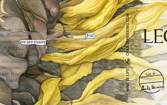
A similar approach was taken when designing the Charlie Herring bottle labels. Tim Phillips (of Charlie Herring – not to be confused with his near-namesake, Tom Phillips) wrote a single paragraph that appears on each label. Different words are picked out for each one, creating an entirely different meaning – and inspiring the name of the wine, beer or cider.
The label project was a creative collaboration between our client (and his young daughter), talented artist Will Rochfort and the team at Tinstar Design.
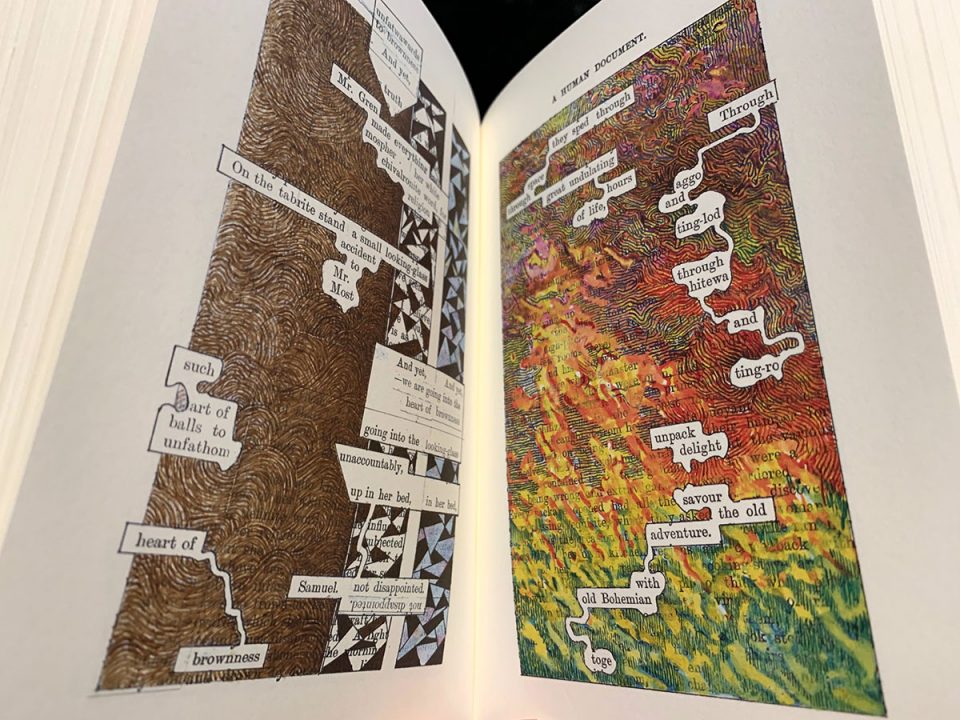
A Humument by Tom Phillips. A treated (defaced) victorian novel.
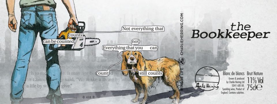
The Bookkeeper, Blanc de blancs label design
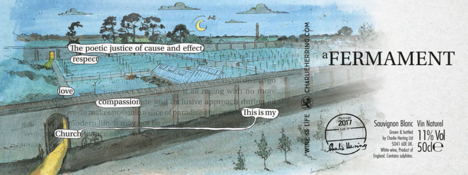
A Fermament label – based on a painting by William Rochfort using Tinstar’s drone footage as reference
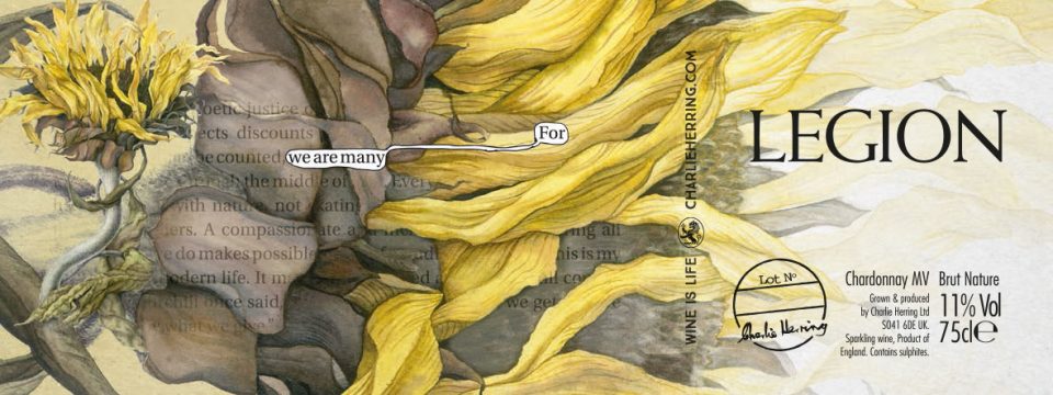
Legion – Chardonnay MV label design
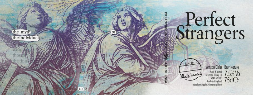
Perfect Strangers – Cider label design
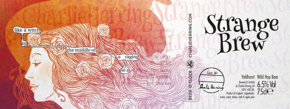
Strangebrew – Wild Hop Beer label design
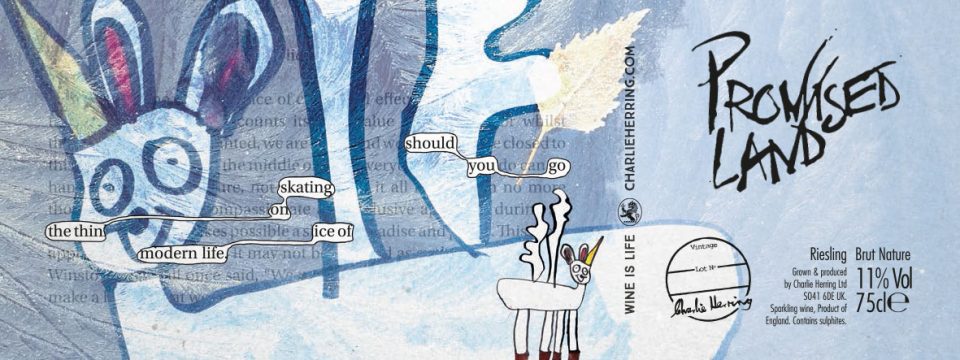
Promised Land – Riesling label design
For the finer details (such as the roundel), initially we discussed the possibility of designing a custom rubber stamp for the client to punch the lot numbers with. Ultimately the roundels were pre-printed (as shown in the image). But in the end, the obvious and most cost effective solution is often the best. All the lot numbers were written by hand after the labels had been applied.
At the launch of the various brews, we discovered the Charlie Herring wine label rolls in a corner, ready to go. Courtesy Charlie Herring Wines.
